Summary of Process
Research, Task Flows, Low Fidelity Wireframes, High Fidelity Mockups, Usability Testing
InstaWeather
Phone App Design
InstaWeather delivers accurate, fast and reliable daily weather forecast, helping users keep track of temperature, location and time of day. The goal of this app is to remove the hustle of sifting through endless amount of pages for weather information. My role was to research and design all the features within the app.
Tools used: Adobe Illustrator, Balsamic Mockups, Marvel
Challenge
- One of the main challenges of this project is to organize and display vital weather information in a useful way.
Objectives
My goal of this case study is to:
- Provide easily accessible weather information
- Reduce time users spend checking the weather
My Design Process
01 Research. Research competitive products and draw up a comparative analysis of each.
02 Generate. Generate concepts through sketches with pen and paper which helps me to create an initial outline of the UI.
03 Visualize. Design wireframes and user flow diagrams to define user interaction with the app.
04 Create. Evolve concepts from sketches and wireframes into high fidelity mockups.
05 Test. Get useful feedback from users on prototyped ideas.
Research
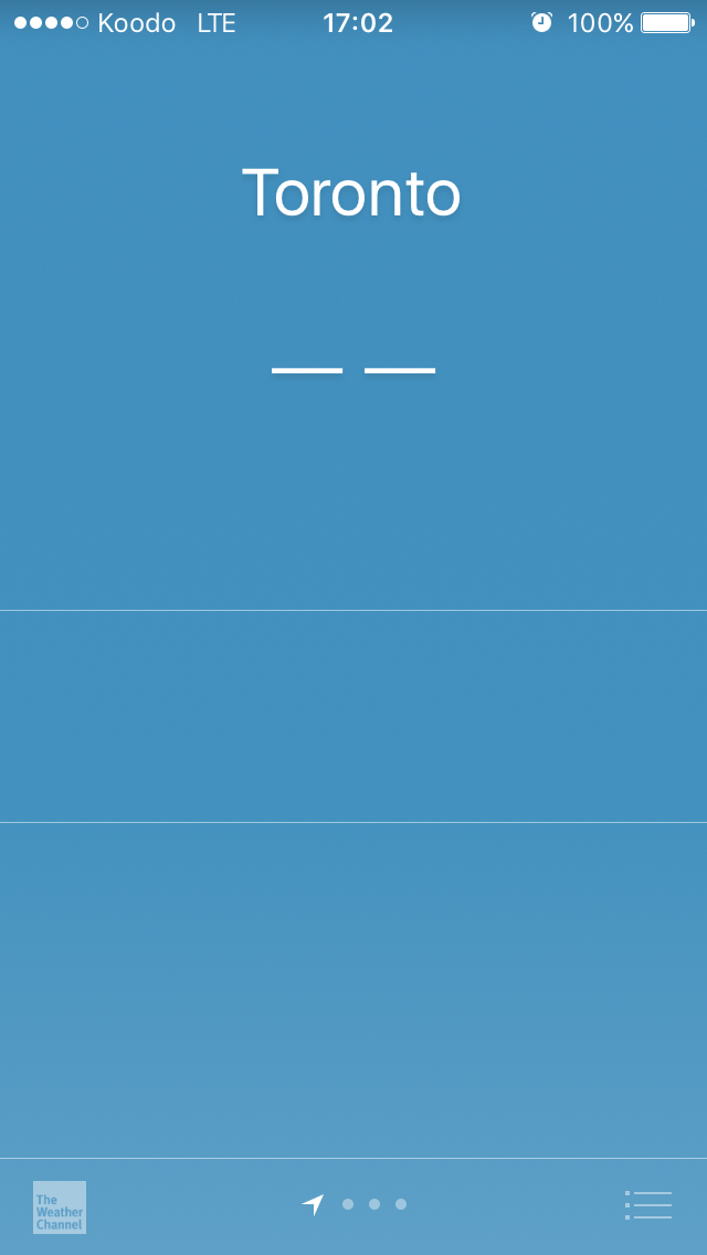
Most of the research this time was done through comparative analysis. I downloaded different weather apps on the market to analyze their user interfaces. I wanted to understand what kind of information was displayed in the app as well as explore how I could make the process of checking for weather simpler.
Research Outcomes
Through this research, I was able to find out that many of the apps I downloaded could be made simpler. My observation was that there was too much information and some of them were redundant for users on the go. To gain access to weekly forecast and wind & pressure information, I had to scroll all the way down through the app, making this ineffective. Also most of the information below the page might be irrelevant for users on the go, who would rather just want to see the temperature of the day as it is.
Work Flows
My research allowed me to come up with different ways which I would go about to create the user interface.
Task Flows
Sketched out a rough general outline of how a user will navigate through the app to perform certain actions. Later on I developed this sketch in Adobe Illustrator, into two separate diagram flows of adding a location and sharing weather information.
Low Fidelity Wireframes
Drew out a low level layout of the homepage, share screen and add location screen using Balsamic Mockup. Each page detailed how a user would go about interacting with the app by detailing the function of each object on the screen. This helped me to decide which buttons or labels would be responsible to perform the user task processes I designed earlier. This guided me to develop high fidelity mockups.
High Fidelity Mockups
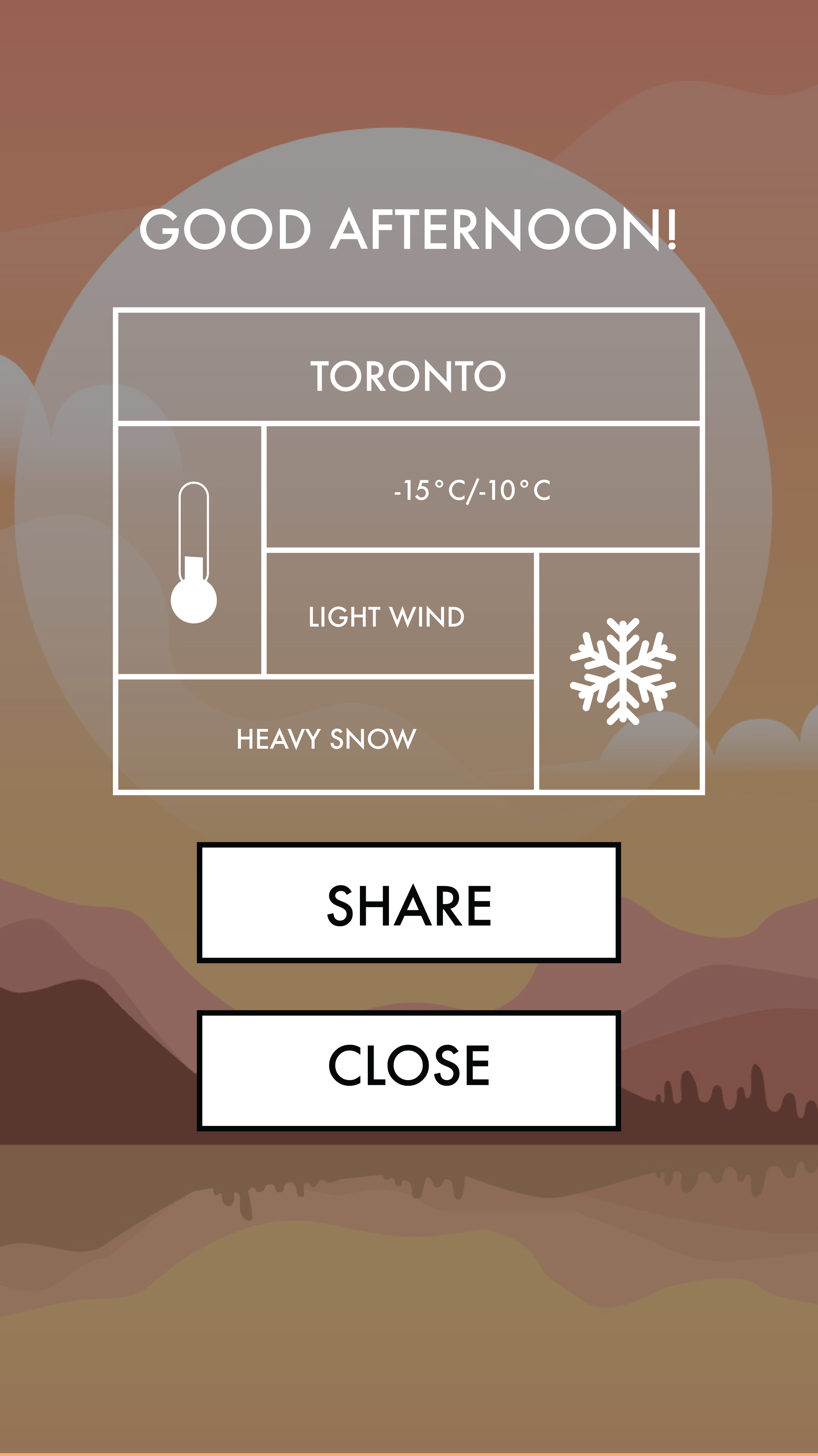
Based on the low fidelity wireframes I was able to develop these further into more visually appealing forms using Adobe Illustrator. I used different background images depending on different times of the day that the user opens the app; brighter backgrounds for daytime and a darker background for the evening. This adds more personality to the greeting message shown to the user when they open the app.
Usability Testing
This process involved me compiling my high fidelity mockups into prototypes using Marvel and sending it out to 2 people for their feedback. Based on this feedback, I made several modifications to the main weather homepage, making the temperature of the day the main focus of users' attention by getting rid of extra weather information such as wind speed and the high-low temperature of the day.
Prototype
Summary
I really enjoyed working on this project especially the user testability phase. one of the most challenging issues that I encountered was coming up with a UI design concept that would capture only the essential weather information needed. Through the user testability I was able to gain valuable feedback which helped me create a UI that was easy on the eye for users.


